

A better way to SEE the data
We all love data. It gives us so much information about our products and helps us merchandise in a scientific way. However, sometimes it can be a headache when you have to deal with the numbers with a naked eye.
But worry no more, we created something in Smart Merchandiser to help you actually SEE the data: Heat Map.
Heat Map
Heat Map is a feature introduced in v3.3. It visualizes product data in a category and displays it from hot to cold. Using Heat Map, you’ll have a much clearer view of the entire category in terms of how products perform, thus making merchandising much easier.
 Heat Map
How to display the Heat Map
Go to Sequence Tab, select a category and go to Analytics Overlay. You’ll see a button called “Heat Map”. Click it and the heat map overlay will appear.
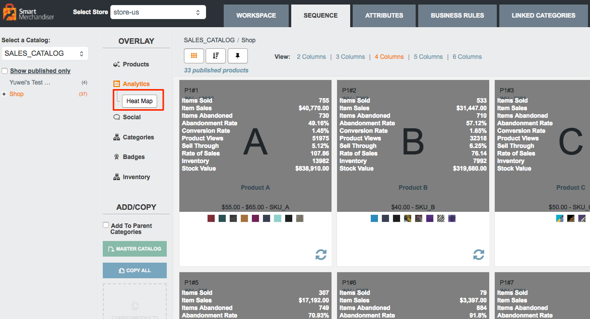 Heat Map button
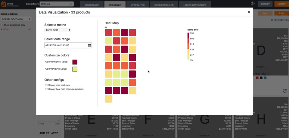
Heat map interface
 Heat Map interface
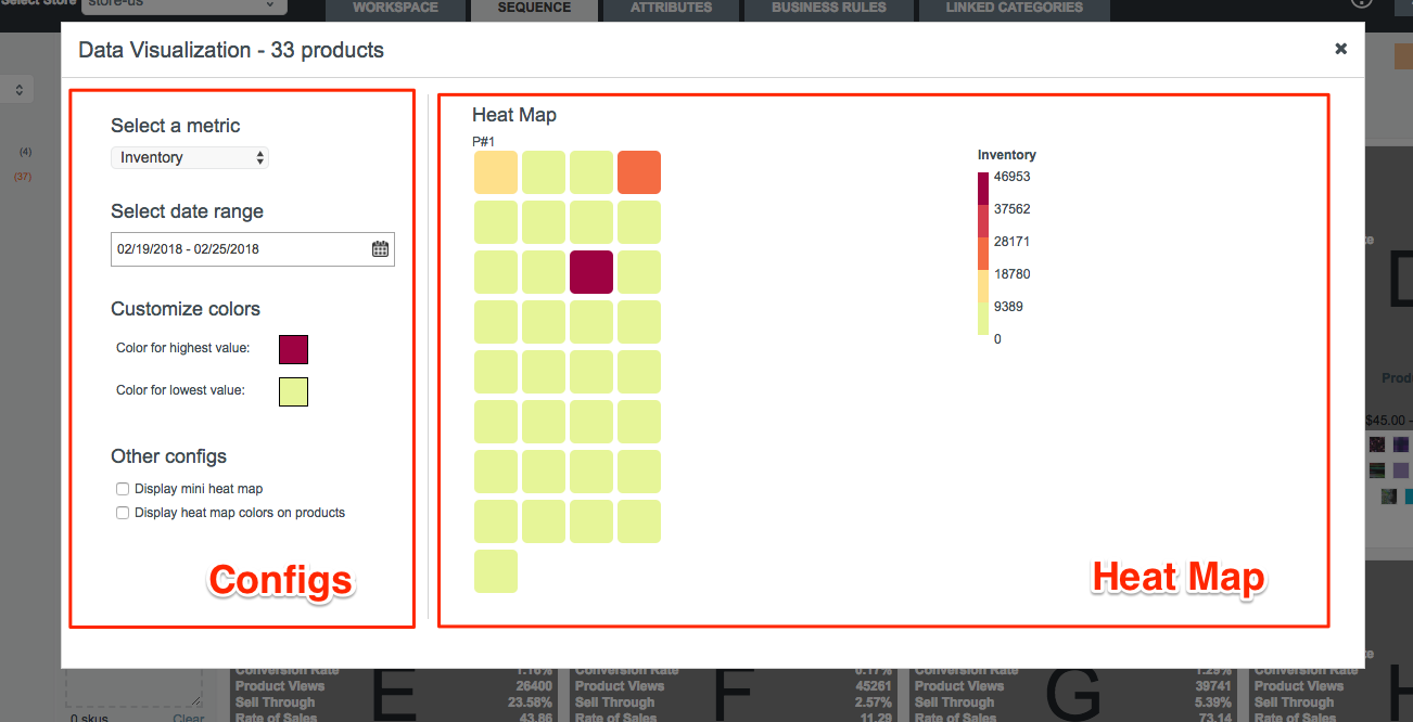
As you can see in the screenshot above, the interface consists of 2 parts: configs and Heat Map. The left side is where you configure your Heat Map: what data you want to display and how you want to display it. The right side displays the heat map, as well as the scale references.
View product details
To view product details, mouse over the product.
 View product details
Locating product from the Heat Map
To locate the product in the product listing, simply click on the cell in the heat map.
 Locate product from the Heat Map
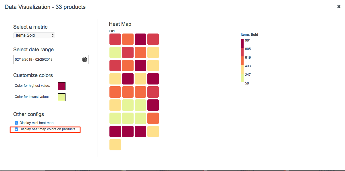
Configure your heat map
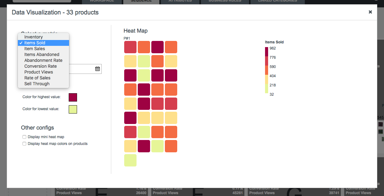
Select correct data
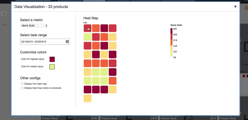
The Heat Map, by default, displays the inventory data. You can select other analytics data like items sold, product views, etc. Note that you need to specify the date range for some of the metrics for them to make sense, like items sold.
 Select the data you want to display
Customize colors
If you’re not comfortable with the default heatmap colors, you can always customize yourself.
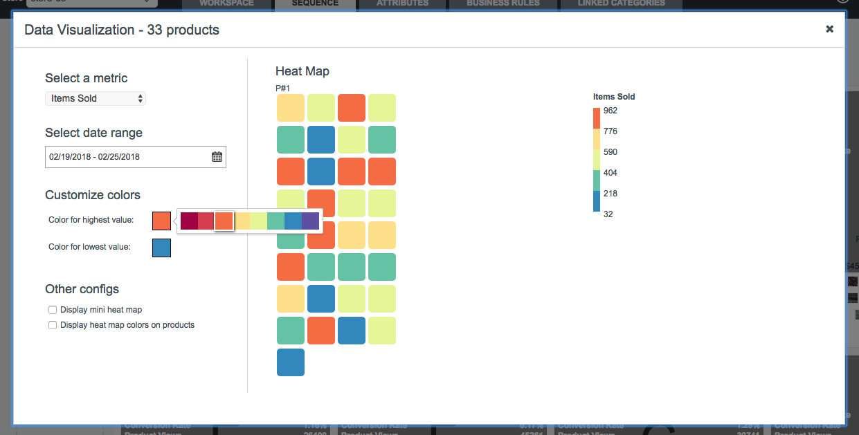 Customize Heat Map colors
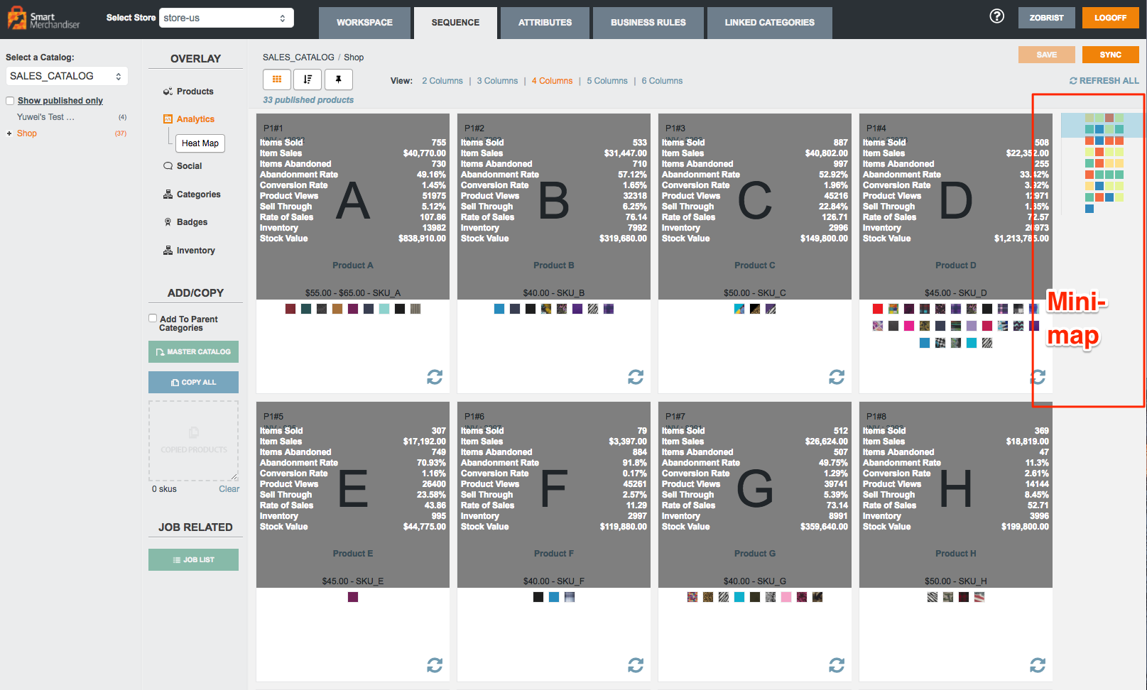
Mini Heat Map
You can also turn on the mini heat map on the right side of the product listing by simply checking the checkbox in the popup, as shown in the following screenshots.
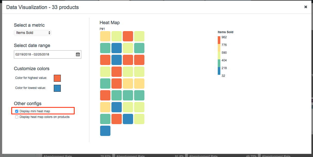 Whether to show a mini heatmap
 Mini Heat Map
The blue window in the Mini Heat Map indicates the products we are currently viewing in the browser. Drag the window to the products we want to view or simply click on the Mini Heat Map. See the following GIF:
 Drag the window or click on the Mini Heat Map
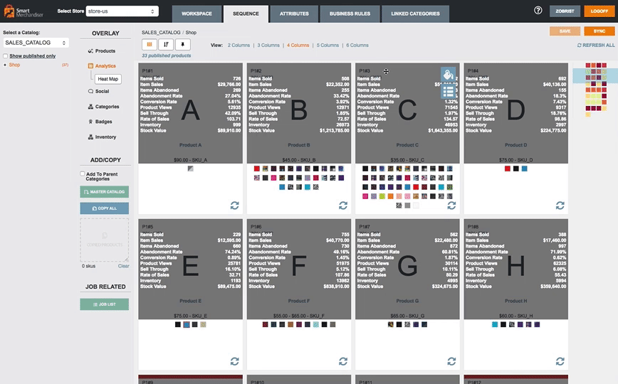
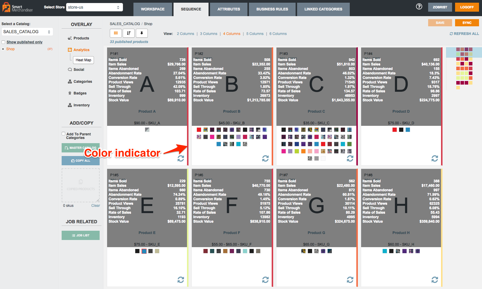
Color indicators on products
If the Mini Heat Map is not clear enough, you can also turn on the color indicators on products. It will display the same colors from the Heat Map on the right side of each product block. See following screenshots:
 Turn on color indicators


